Dashboard Gauge Item
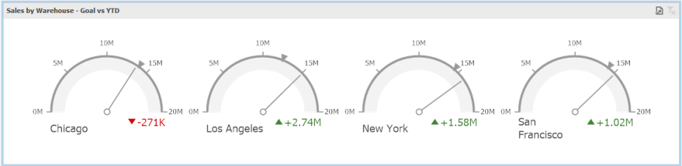
The Gauge Dashboard item displays a series of gauges. Each gauge can communicate two values – one with a needle and the other with a marker on the scale.
Providing Data
Data items are arranged in containers. Each data item container can hold two data items. The first item contains actual data and the second item (optional) contains target data. If both items are provided, gauges show the difference between actual and target values.
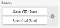
If only one item is provided, gauges display values from this item.
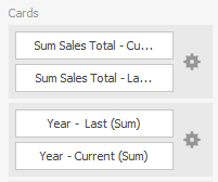
- You can fill several data item containers in the Gauge section and use the Values drop-down menu to switch between the provided values.
- To invoke the Values menu, click the icon in the dashboard item caption.
- Use the Values drop-down menu
 to switch between the provided values.
 - To invoke the Values menu, click the icon in the dashboard item caption.

Note! This drop-down menu is available if the Series section is not empty. Otherwise, a separate card is created for each data item container, and all cards are displayed simultaneously.
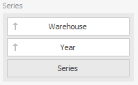
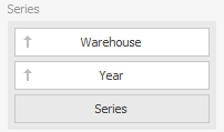
Series
The Series section contains data items whose values are used to label gauges.
Delta
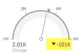
Gauges allow you to display the difference between the actual and target values of a particular parameter. This difference is called delta.
Delta is shown with a delta indicator (indicating whether the actual value is less than or greater than the target value) and delta values (representing this difference as an absolute value or a variation).
- To customize settings that relate to the calculation and display of deltas, use the options buttons (the icon) displayed next to the data item container.
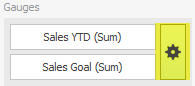
These buttons invoke the Gauge Settings dialog.
Use it to define the condition for displaying delta indication, specify which delta values should be displayed, and introduce the comparison tolerance.
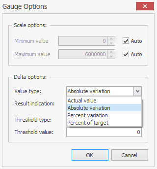
Delta Values
You can specify which values should be displayed within cards.
- Use the Value type dropdown box in the Card Settings window to select the value that will be displayed as the main delta value. Additional delta values are selected automatically.
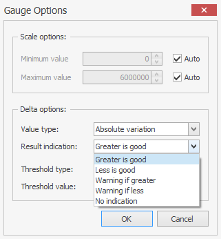
Delta Indication
- You can specify the condition for displaying delta indication.
- To do this, use the Result indication combo box in the Gauge Settings window.
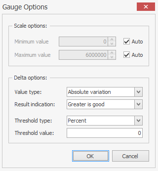
Comparison Tolerance
The comparison tolerance allows you to create more advanced conditions for displaying delta indication. For instance, you can specify that a specific indication should be displayed when the actual value exceeds the target value by 10% or by $2K.
Use the Threshold type combo box to select whether you wish to specify the comparison tolerance in percent values or in absolute values. Then use the Threshold value box to specify the comparison tolerance.
Gauge Scale
By default, the Gauge dashboard item automatically determines the range of the gauge scales based on the values they display.
You can override this behavior and specify maximum and minimum values on the scale.
- Invoke the Gauge Options window using the Options button displayed in the data item container in the Gauges section.
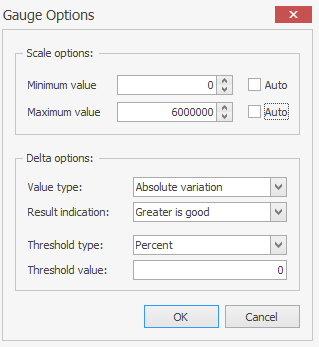
- In the Gauge Options window, uncheck the Auto check box for the maximum or minimum value, and specify this value in the corresponding field.
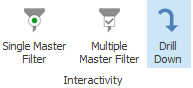
Interactivity
When Interactivity is enabled, an end-user can click a grid row to make other dashboard items only display data related to the selected record.
Drill-Down
The built-in drill-down capability allows end-users to change the detail level of data shown in dashboard items on the fly.
When drill-down is enabled, an end-user can click a card to view the details.
Drill-down requires that the Series section contain several dimensions, from the least to the most detailed dimension.
- To enable drill-down, click the Drill Down button on the Data – Master Filter menu.
- To return to the previous detail level (drill-up), use the button in the caption of the Gauge item.

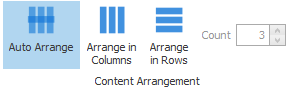
Layout
The Grid item allows you to introduce cell merging and banded rows, and specify the visibility of column headers and grid lines.
- Select an option from the Design – Content Arrangement menu.
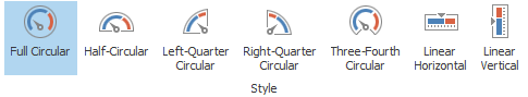
Style
The Gauge dashboard item allows you to select the gauge type.
- Select an option from the Design – Style menu.
Labels
- Select if to show labels or not.
