-
-
-
-
-
- Data Grid
- Data Grid Columns
- Open a Data Grid
- Sort Data Grid Columns
- Filter Data Grid
- Data Grid Grouping
- Merge Cells in Data Grid
- Data Grid Formatting
- Data Grid - Conditional Formatting
- Data Grid - Calculated Fields
- Data Grid Drill Down
- Data Grid Views
- Generate Report from Data Grid
- Refresh Data Grid
- Copy Data Grid Records
- Export Data Grid Data
- Show all articles ( 1 ) Collapse Articles
-
- Pivot Grid
- Pivot Grid Areas
- Pivot Grid Fields
- Pivot Grid Summarize
- Format Pivot Grid Fields
- Expand - Collapse Pivot Grid Columns
- Sort Pivot Grid
- Pivot Grid - Calculated Fields
- Pivot Grid Filters
- Pivot Grid Drill Down
- Pivot Grid Charts
- Pivot Grid Maps
- Pivot Grid Views
- Refresh Pivot Grid
- Export Data from the Pivot Grid
- Embed Pivot Grid into Report
- Show all articles ( 1 ) Collapse Articles
-
-
-
- Dashboard Items
- Dashboard Chart Item
- Dashboard Pie Item
- Dashboard Data Grid Item
- Dashboard Pivot Table Item
- Dashboard Gauge Item
- Dashboard Card Item
- Dashboard Scatter Chart Item
- Dashboard Treemap
- Dashboard Range Filter Item
- Dashboard Filter Elements Item
- Dashboard Text Item
- Dashboard Image Item
- Dashboard Group Item
-
-
-
-
- Schedule Server Jobs
- Add a Schedule Job - Simple Email
- Add Schedule Job - Merged Email
- Add Schedule Server Job - Merged Report
- Add Schedule Job - Alert DBxtra Users
- Add Schedule Server - Export Report Objects
- Add Schedule Job - FTP Upload
- Add Schedule Job - Print Report
- Add Schedule Job – Google Drive Upload
- Add Schedule Job – Dropbox Upload
- Add Schedule Job – Data Dump
- Edit - Delete Schedule Server Jobs
-
-
-
- DBxtra - Excel Reporting Service
- Install the XL Reporting Service
- XL Reporting Service - Driver Requirements
- XL Reporting Service Interface
- Connect Excel Reporting Service to DBxtra Report Repository and Login
- Insert the Report Object's Data into Excel
- Refresh Your Data
- Open DBxtra Reports and Dashboard from within Excel
- XL Reporting Service Security
-
- Articles coming soon
-
-
- Migrating the Report Web Service from legacy (DBxtra version 8.2.3 and prior) to responsive (DBxtra version 9.0.0 +)
- DBxtra version 7.1.0 on Internet Information Server – IIS 6
- DBxtra 7.1.0 on Internet Information Server – IIS 7
- DBxtra version 7.1 – Upgrade DBxtra Report Repository to SQL Server Express.
- How to configure DBxtra to use Internet Information Services on Windows Server 2012
- Open DBxtra reports in web browser on a new tab
- DBxtra 7 – Migrate the DBxtra Repository from a Network Share to Report Web Service
- Report Web Service: How to retain the minimalist menu look on custom styles (Legacy Report Web Service DBxtra ver. 8.2.3 amd prior)
- The Report Web Service shows empty reports or dashboards
- Pass login information from an external application to the DBxtra Report Web Service
- Pass login information from an external application to the DBxtra Report Web Service (DBxtra version 9+ - Responsive)
- Deploying the Report Web Service to Azure (Web Sites)
- What happens to report objects style customizations when I change interfaces in the Report Web Service
Choropleth Map
- Main
- DBxtra Dashboard Designer
- Dashboard Items
- Dashboard Maps
- Choropleth Map
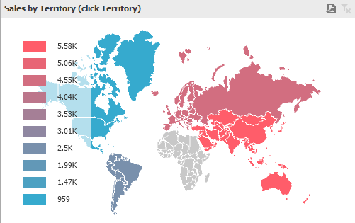
The Choropleth Map dashboard item allows to colorize the required areas in proportion to the provided values.
Providing Maps
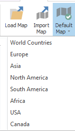
Default Maps
Default maps showing various parts of the world.
- World Countries – a world map.
- Europe – a map of Europe.
- Asia – a map of Asia.
- North America – a map of North America.
- South America – a map of South America.
- Africa – a map of Africa.
- USA – a map of the USA.
- Canada – a map of Canada.
Select a default map
- To select a default map click on the Default Map button on the Design – Open menu.
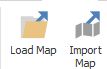
Custom Maps
You can use shape-file (.shp ) vector format to provide custom maps.
- Either load a shape-file or import a shape-file map by clicking the button on the Design – Open menu.
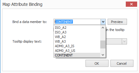
Map Attributes
You can view supplemental information (such as the name of the country, state, etc.).
- Click the Options button next to the Attribute data item.
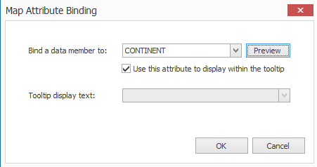
- Click Preview.
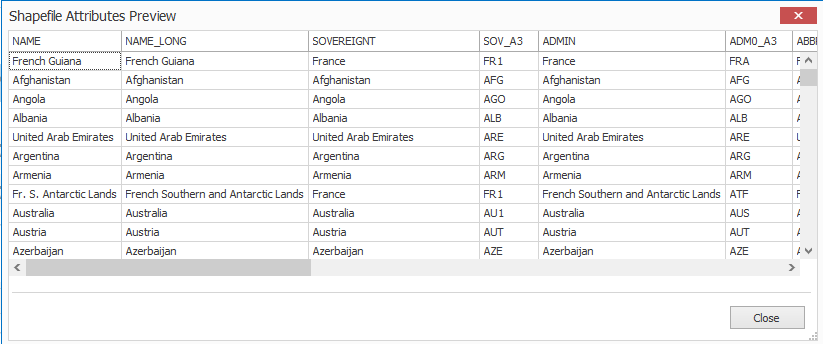
This displays the available attributes for your current map.
Note! Each set of attribute values is related to a specific map shape.
Data Binding
The Choropleth Map has the Attribute and Maps data sections.
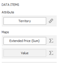
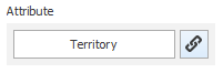
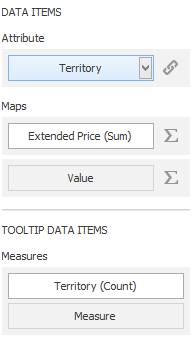
Attributes
The Attribute section contains the Attribute data item, which allows you to associate map shapes with data source field values.
- To associate map shapes with data source field values, drag-and-drop the required dimension to the data item’s placeholder and select the required attribute in the Map Attribute Binding dialog.
To invoke this dialog, click the Options button next to the Attribute placeholder.

The Maps data section contains data items whose values are used to color map shapes.
- Click the Options button next to the Value placeholder and select the required map type in the invoked Choropleth Map Options dialog.

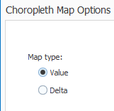
- Select Value to map colors map shapes depending on the values provided.
- Select Delta, to map colors map shapes depending on the difference between two values.
Tooltip
- To add supplementary content to the tooltips, drag and drop the required measures to provide additional data.
Coloring
The Choropleth Map item colors map shapes depending on the values.
Palette – Scales
It automatically selects palette and scale settings to color the map.
- To customize the palette, click the Options button next to the data item that contains these values.
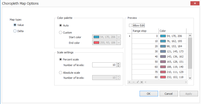
Color Palette
Color palette – allows you to specify the start and end color of the palette.
Scale
Scale settings – specifies whether a percent scale or an absolute scale is used to define a set of colors.
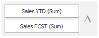
Delta
Delta indicates the difference between the actual and target values of a particular parameter.
- Click the Options button next to the data item container to specify delta indication.
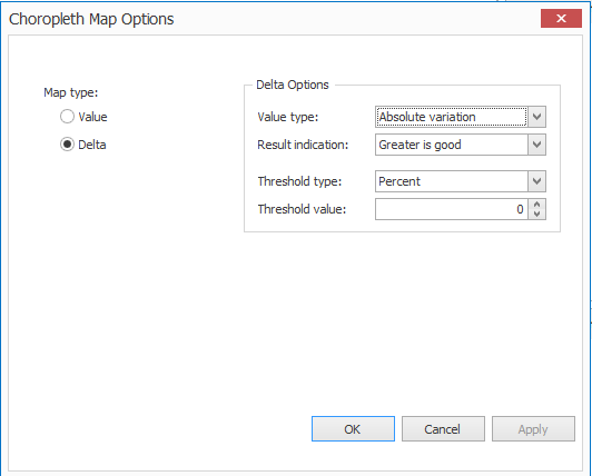
Options
Value types
- Use the Value type combo box to select the value that will be displayed as the delta value.
Result Indications
- Use the Result indication combo box to specify the condition that will be used
Threshold type and Threshold value
- Specify that a required indicator should only be displayed when the difference between the actual and target values exceeds a specified value.
Use the Threshold type combo box to select whether you wish to specify the threshold in percentage values or in absolute values. Then use the Threshold value box to specify the threshold value.
Legend
A legend is the element of a map that shows values corresponding to each color.
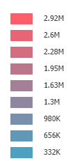
- Click the Show Color Legend button in the Color Legend – Design menu.
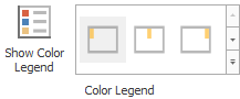
- Specify the legend’s position and orientation
Interactivity
When Interactivity is enabled, an end-user can click a grid row to make other dashboard items only display data related to the selected record.